The impact of a logo cannot be overstated when it comes to shaping the perception of a company, brand, or franchise. A well-designed logo instantly communicates the essence of the business it represents, influencing how customers perceive and remember the brand. A strong logo attracts people to the brand, leaving a lasting positive impression and fostering brand loyalty. Conversely, a poorly crafted logo can detract from the brand’s image, resulting in diminished recognition and a less favorable perception among consumers. In essence, a logo serves as a powerful tool for brand identity and can significantly impact the success and longevity of a business.
Greggs’ Logo has undergone a few different changes during the companies history, finally settling on the iconic blue, orange and white Logo we have today.
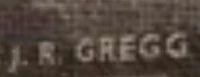
When the bakery was original founded it had a standard name written on the front of the building which read ‘J. R. Gregg’ like many other shops, bakeries and butchers of the time.
In the 1970s the logo underwent a change and met with the groovy company logos of the time with a stylishing typeface.
Then in 1986 the company changed their logo again which is similar to the logo we see today. It featured 4 smalls squares on the left and a more traditional font with the word ‘Greggs’.
In the early 2000s Greggs logo changed again and introduced the blue, orange and white we see today but introduced a more modern font for the time. They also had a varient of the logo with the words ‘The Bakers’ included.
The in 2014 to fit in with the flat digital style of branding they changed their logo again with a more modern font and some gradient in the colours. There are also varients that are one colour and also include various slogans.
A History of Greggs Logo
1950s – 1970s
1970s – 1986

1986 – 2001
2001 – 2014

2014 – Present