Disclaimer: This is an unofficial fan-made website. We are not affiliated with, endorsed by, or connected to Greggs plc. All logos and trademarks are the property of their respective owners.
The Power of a Logo
The impact of a logo cannot be overstated when it comes to shaping the perception of a company, brand, or franchise. A well-designed logo instantly communicates the essence of the business it represents, influencing how customers perceive and remember the brand. A strong logo attracts people to the brand, leaving a lasting positive impression and fostering brand loyalty.
Conversely, a poorly crafted logo can detract from the brand's image, resulting in diminished recognition and a less favourable perception amongst consumers. In essence, a logo serves as a powerful tool for brand identity and can significantly impact the success and longevity of a business.
Greggs' logo has undergone a few different changes during the company's history, finally settling on the iconic blue, orange and white logo we have today.
Logo Evolution Timeline
1950s – 1970s: The Original
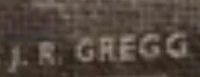
When the bakery was originally founded it had a standard name written on the front of the building which read 'J. R. Gregg' like many other shops, bakeries and butchers of the time. This simple signage reflected the modest beginnings of what would become one of Britain's most beloved brands.
1970s – 1986: The Groovy Era

In the 1970s the logo underwent a change and met with the groovy company logos of the time with a stylish typeface. This reflected the design trends of the era, with flowing letters and a more contemporary feel that aligned with the decade's aesthetic preferences.
1986 – 2001: The Foundation of Modern Greggs
Then in 1986 the company changed their logo again which is similar to the logo we see today. It featured 4 small squares on the left and a more traditional font with the word 'Greggs'. This design marked a significant shift towards corporate branding and established visual elements that would carry forward into future iterations.
2001 – 2014: Introducing the Colour Palette

In the early 2000s Greggs' logo changed again and introduced the blue, orange and white we see today but with a more modern font for the time. The colour combination – blue representing trust and reliability, orange conveying warmth and energy, and white ensuring clarity – created a memorable brand identity that stood out on British high streets.
They also had a variant of the logo with the words 'The Bakers' included, emphasising the company's heritage and commitment to fresh baking.
2014 – Present: The Digital Age

Then in 2014, to fit in with the flat digital style of branding, they changed their logo again with a more modern font and some gradient in the colours. This refresh ensured the logo worked effectively across digital platforms, mobile apps, and social media whilst maintaining the brand's recognisable identity.
There are also variants that are one colour and also include various slogans, allowing for flexibility across different marketing materials and applications. The current logo represents a perfect balance between tradition and modernity, honouring Greggs' heritage whilst embracing contemporary design principles.
Logo Design Elements
Colour Psychology
The blue, orange and white colour scheme is carefully chosen. Blue evokes trust, reliability and professionalism – essential qualities for a food brand. Orange conveys energy, warmth and affordability. White provides clarity and represents cleanliness and freshness.
Typography
The evolution of Greggs' typography reflects changing design trends, moving from ornate 1970s lettering to clean, modern sans-serif fonts that work across all media. The current font is bold, legible and friendly, reflecting the brand's approachable nature.
Brand Consistency
Despite multiple redesigns, Greggs has maintained core elements that ensure brand recognition. The name remains prominent, the colour palette has been consistent since 2001, and the overall feel remains welcoming and accessible to all customers.
Impact on Brand Recognition
The current Greggs logo is one of the most recognisable in British retail. A study found that 96% of UK adults recognise the Greggs brand, putting it amongst the most well-known brands in the country. This recognition is partly down to the effective logo design that has evolved thoughtfully over the decades.
The logo's simplicity makes it versatile – it works equally well on shop fronts, packaging, digital platforms, and promotional materials. The bold lettering ensures visibility from a distance, crucial for high street locations, whilst the friendly, rounded letters create an approachable feel that aligns with Greggs' positioning as an affordable, everyday bakery for everyone.
Digital Adaptation
The 2014 refresh was particularly important for digital adaptation. The simplified design scales well across different screen sizes, from desktop websites to mobile apps. The flat design aesthetic fits modern user interface trends, ensuring the brand feels contemporary and relevant to younger consumers whilst remaining familiar to long-time customers.
Frequently Asked Questions
Why did Greggs change their logo so many times?
Like most successful brands, Greggs updated their logo to stay current with design trends and consumer expectations. Each redesign reflected the aesthetic preferences of its era whilst maintaining brand recognition. The changes also supported the company's growth from a regional bakery to a national chain.
What do the colours in the Greggs logo represent?
Blue represents trust, quality and professionalism. Orange conveys warmth, energy and affordability. White symbolises cleanliness and freshness – all important attributes for a food retailer.
When did Greggs introduce their current logo?
The current logo design was introduced in 2014, featuring a modern sans-serif font with a subtle gradient effect in the blue and orange colours.
Does Greggs use different logo versions?
Yes, Greggs has several logo variants for different applications. These include single-colour versions for specific uses and versions with additional text like promotional slogans, allowing flexibility whilst maintaining brand consistency.